import numpy as np
import seaborn as snsWe will try to understand a quantile plot.
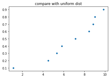
Lets us generate n numbers from a uniform distribution. We will then compare those numbers with uniform and normal distribution
n = 9
a = np.sort(np.random.uniform(1, 10, size=n))
a
array([1.14572246, 4.51022338, 5.33175385, 5.82544947, 7.14328162,
8.45844914, 8.84241316, 9.01455406, 9.84060727])quantiles = [k/(n+1) for k in range(1, n+1)]
quantiles [0.1, 0.2, 0.3, 0.4, 0.5, 0.6, 0.7, 0.8, 0.9]If we take the quntiles of a, they will be equally spaced. Now lets divide the area under the target distribution with which we are comparing and read the corresponding values of the random variable.
If the array values and the corresponding values from the distribtution are proportional (ie, straight we have a straight line in a plot), then the array is close to the distribution
from scipy.stats import norm, uniformdist = norm()
dist_vals = dist.ppf(quantiles)
print(dist_vals)
ax = sns.scatterplot(x=a,y=dist_vals)
ax.set_title('compare with normal dist')[-1.28155157 -0.84162123 -0.52440051 -0.2533471 0. 0.2533471
0.52440051 0.84162123 1.28155157]Text(0.5, 1.0, 'compare with normal dist')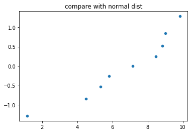
dist = uniform()
dist_vals = dist.ppf(quantiles)
print(dist_vals)
ax = sns.scatterplot(x=a,y=dist_vals)
ax.set_title('compare with uniform dist')
[0.1 0.2 0.3 0.4 0.5 0.6 0.7 0.8 0.9]Text(0.5, 1.0, 'compare with uniform dist')